The Quiet Luxury Shift: How Old Money Style Is Evolving
Old money style is quietly shedding its crests and logos. Here's why the aesthetic is evolving toward quiet luxury — and what's replacing the signifiers.
Redaktionell geprüft: Vor der Veröffentlichung prüfen wir Tragbarkeit, Proportionen und Alltagstauglichkeit. Unsere redaktionelle Arbeitsweise und Bildrichtlinie erklären wir unter Über uns; Angaben zur Unabhängigkeit bei Affiliate-Links stehen im Affiliate-Hinweis.
Five years ago, old money style meant crests. A signet ring, a monogrammed loafer, a quarter-zip with a country club logo stitched over the heart — the whole point was that you could identify the reference at a glance. That's no longer the version of the aesthetic doing the most work. Old money style is evolving, and it's evolving away from anything you'd need to recognize.
What's replacing the crests is quiet luxury — fewer signifiers, better fabric, and a wardrobe built to look expensive without saying so. This isn't a rebrand. It's a genuine shift in what the aesthetic is trying to communicate, and understanding why it happened tells you more about how to dress the part in 2026 than any single old money outfit could on its own.
What's Driving the Shift Away from Logos
Old money style, in its original 2020s TikTok form, borrowed its visual vocabulary from actual inherited wealth — Ralph Lauren catalogs, Ivy League crests, the Kennedy compound. It was aspirational cosplay, and the logos and monograms were the point. They signaled that you knew the reference.
The shift toward quiet luxury tracks with a broader cultural fatigue around visible status markers. Economic uncertainty makes conspicuous branding feel tone-deaf — nobody wants to look like they're announcing spending power during a stretch when most people are watching their budgets. At the same time, luxury counterfeiting has gotten good enough that logo recognition stopped being a reliable status signal. If a fake can carry the same monogram, the monogram stops meaning anything. Fabric weight and construction can't be faked as easily, so that's where the actual signaling moved.
This reflects the shift from the 2023 maximalist old money interpretation — crests, monograms, obvious brand callouts — toward the SS26 reading, where the wealth signal is the drape of the trouser and the weight of the knit, not anything printed or embroidered on it.
Worth noting: this isn't old money disappearing. It's old money maturing past the phase where it needed to prove itself with references. The aesthetic that used to need a crest to be legible now trusts the silhouette to do that work alone.
The Neutral Palette Wasn't Always This Strict
One thing that gets flattened in most coverage of this aesthetic: old money's color story used to have more range than people remember — navy blazers, hunter green, burgundy accents pulled straight from equestrian and prep school uniforms. Quiet luxury tightened that palette considerably, favoring ivory, camel, charcoal, and black almost exclusively.
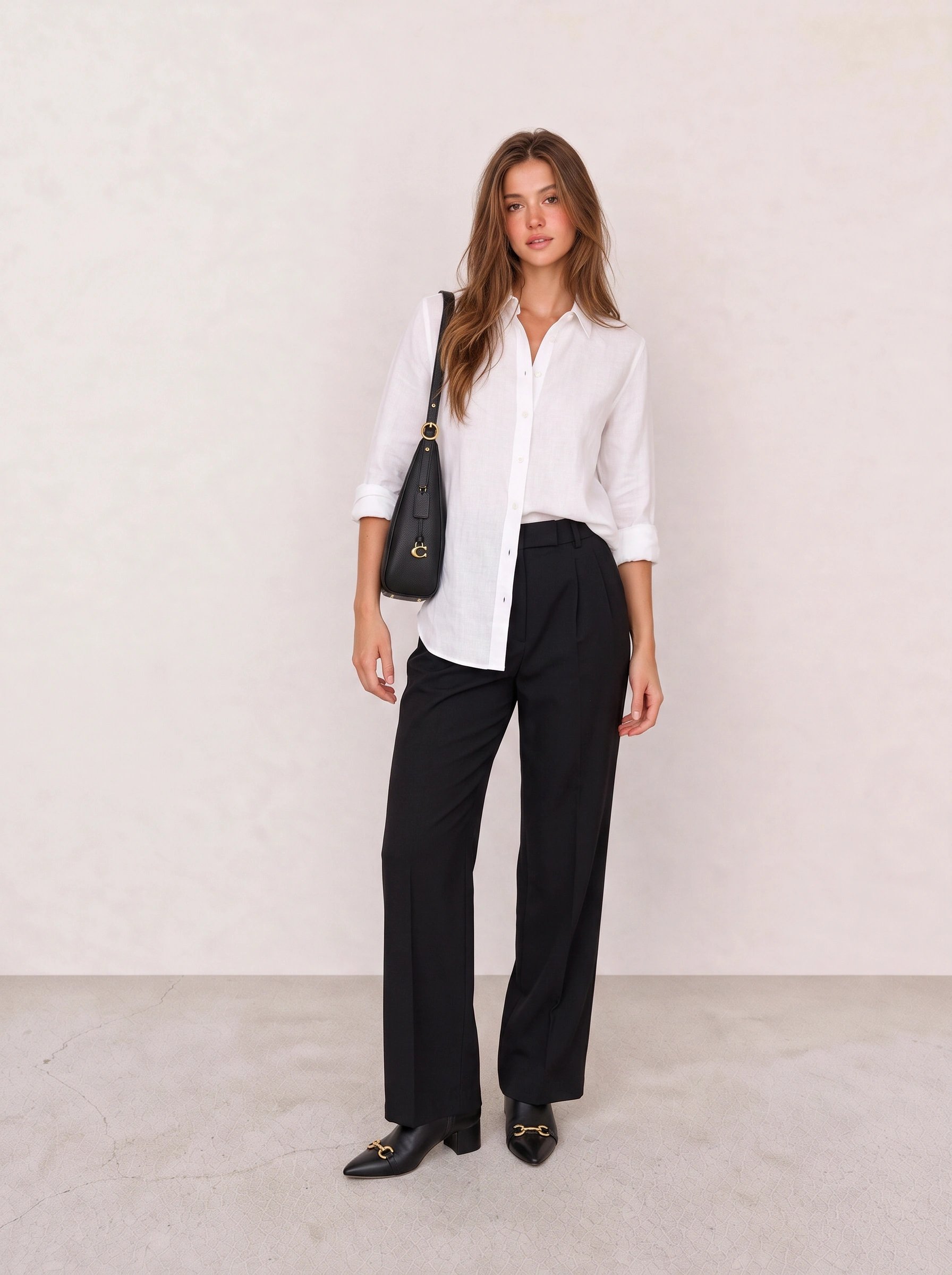
The mechanism here is contrast, not color. White against black reads sharp and deliberate without needing a third tone to explain itself. The button-down's crispness against the fluid drape of the trouser is what makes this look formal enough for an office but not stiff — swap the trouser for something slim and cropped and the whole thing reads more corporate than considered.
The formula: a proper white button-down, black trousers with actual weight to the fabric, and boots with just enough hardware to register as detail rather than decoration. This is the easiest entry point on this list if you're building a quiet luxury capsule from zero — the pieces are things most closets already have a version of.
Texture Replaced the Logo as the New Status Signal
Most people assume the quiet luxury shift is only about removing things — no logos, no obvious labels, nothing loud. That's half the story. The more useful half is what moved in to fill the space: texture became the primary way this aesthetic communicates quality now.
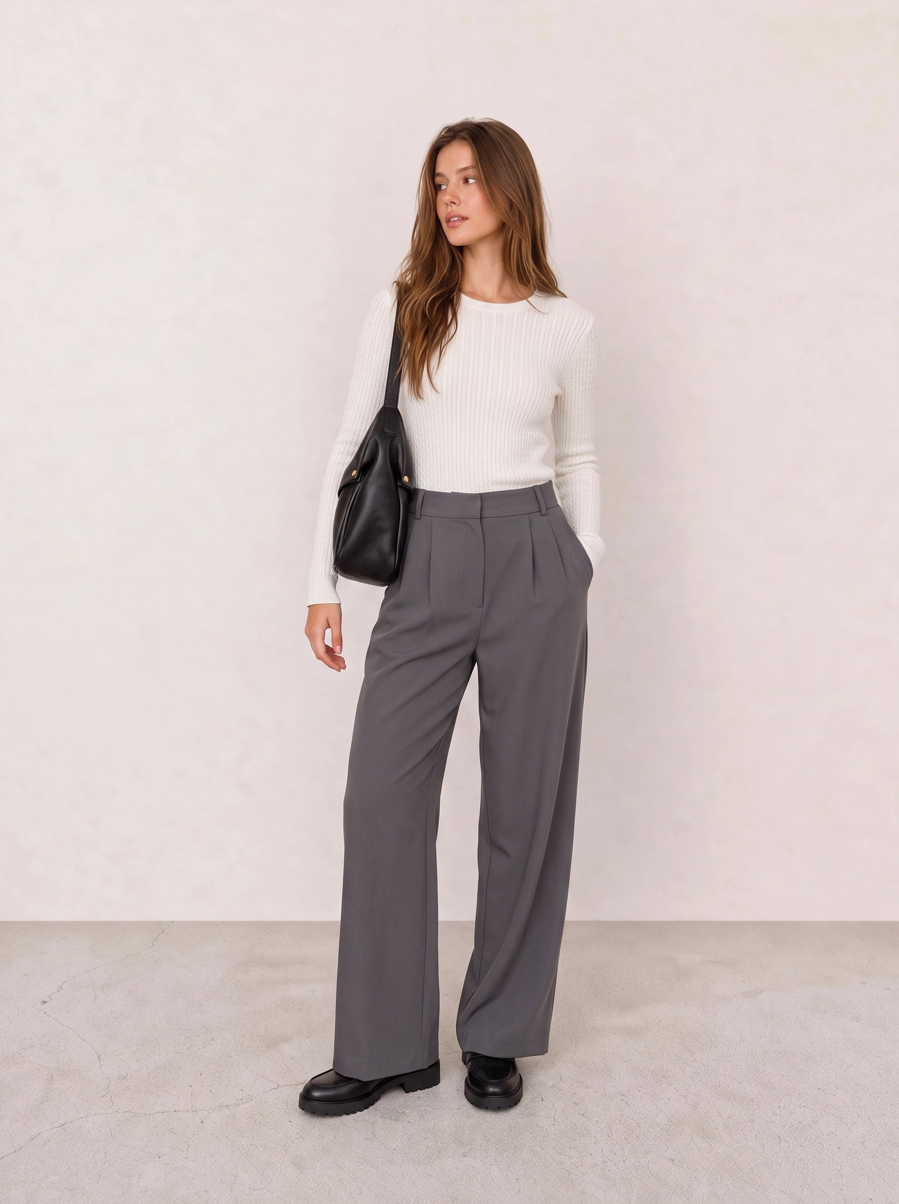
This is probably the clearest example of the shift in the whole cluster. The ribbed knit does something a smooth sweater can't — the visible texture reads as intentional craft, the kind of detail that photographs poorly but feels expensive in person. Pair that against the charcoal wide-leg trouser, and the outfit is working almost entirely in tonal variation: ivory against charcoal, ribbed against flat-front. Nothing here is loud, and that's deliberate.
Without the ribbing, this reads as a plain sweater-and-trouser combination — competent, but forgettable. The texture is what pushes it from "neutral outfit" into "quiet luxury." The wide-leg cut also does real work: it balances the fitted sweater on top and keeps the proportion from tipping into anything too fitted or corporate.
This is the outfit for a Monday client meeting that runs long, followed by drinks you didn't plan for — nothing about it needs adjusting between the two settings, which is the actual point of dressing this way.
The mistake most people make chasing this look is buying a cheap ribbed knit and assuming the texture alone will read as expensive. It won't. Thin, synthetic ribbing photographs fine but collapses in movement and pills within a season — this is one category where the fabric actually needs to earn the silhouette.
Where Warm Neutrals Still Have Room to Work
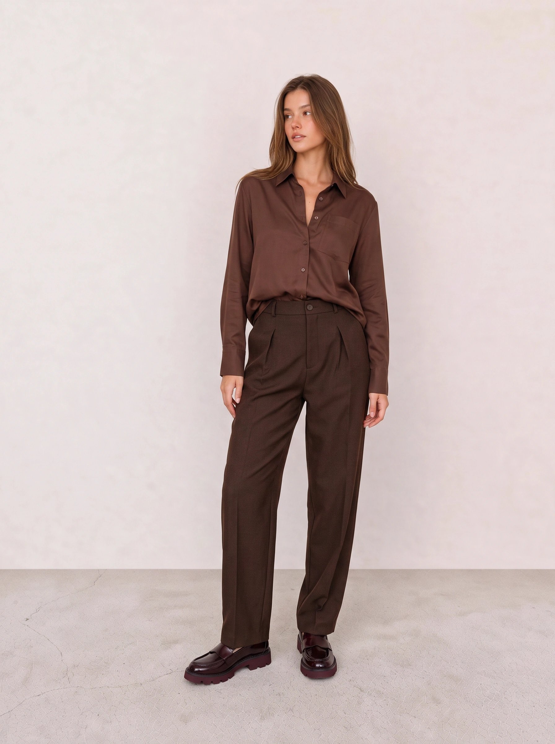
Head-to-toe brown is a genuine tonal-dressing move — same color family, different fabric weights, which keeps the outfit from reading flat or costume-y the way full-color matching sometimes does. The burgundy loafer is the one place this outfit lets a second tone in, and it's placed at the foot, low enough that it reads as accent rather than competition.
If you only own one piece from this outfit, start with the trousers — the pleating and taper carry most of the polish, and they'll work under a plain shirt just as easily.
A trap specific to this transitional phase of the aesthetic: swapping a logo belt for a logo-free one but keeping every other maximalist habit — layered gold jewelry, a monogrammed bag, matching accessories head to toe. That's not quiet luxury. That's old money with the volume turned down by ten percent instead of sixty.
How to Tell If Your Old Money Look Is Dated
The fastest test: if you can name the reference out loud — "this is giving Kennedy compound" or "this is giving prep school" — the outfit is still working in the earlier, more literal phase of the trend. The current version doesn't quote anything. It just looks well made.
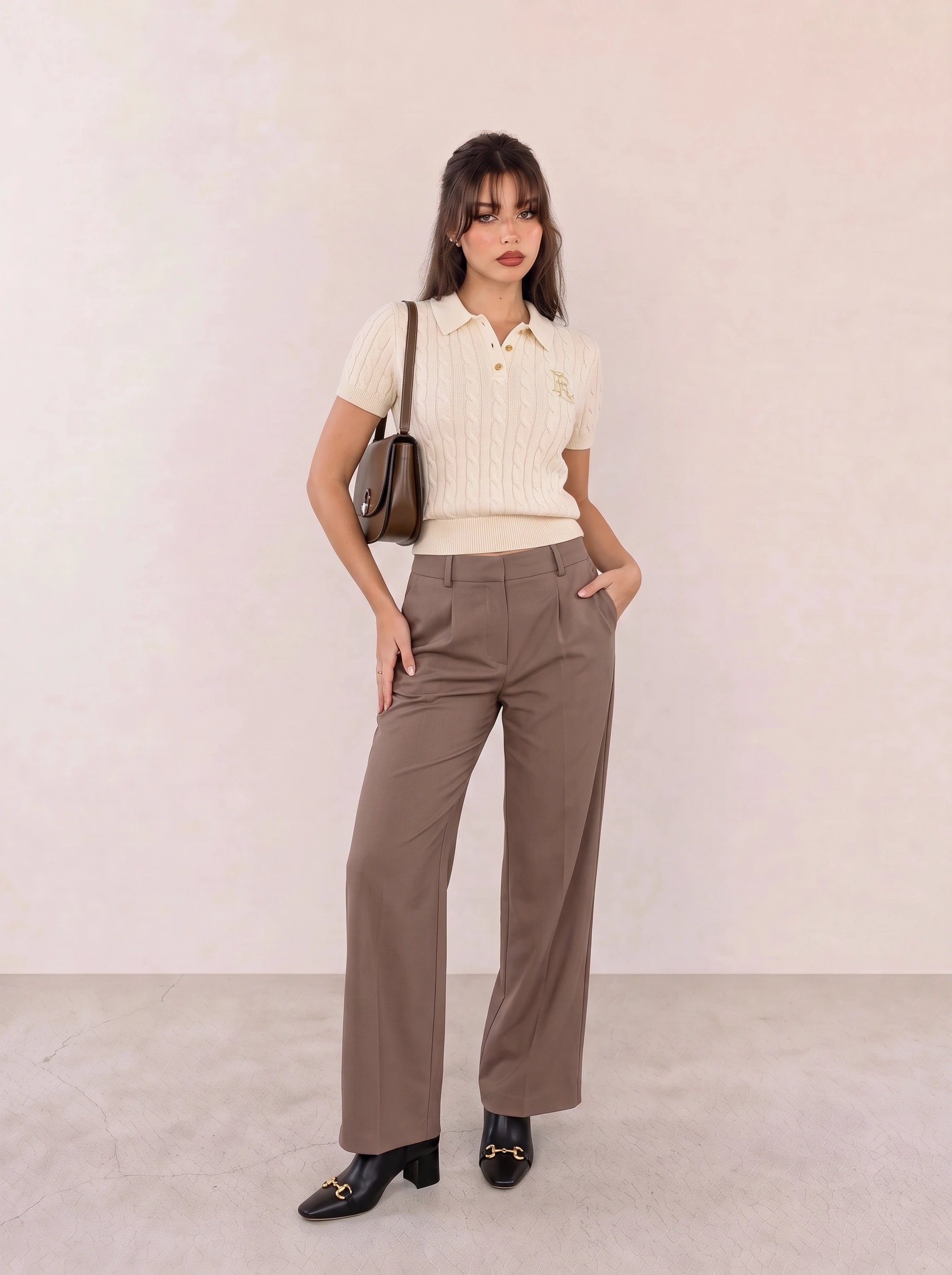
The cable-knit texture on the polo top is what keeps this from reading like a golf uniform — a smooth polo in the same silhouette would tip the whole outfit toward country club costume instead of considered dressing. The brown wide-leg trouser and matching shoulder bag round out a tonal palette that does the color-coordination work quietly, in the background, rather than announcing itself.
Soft Color Is the Next Frontier of This Evolution
If the first phase of quiet luxury was about stripping color down to ivory, camel, and charcoal, the next phase — the one already visible in current collections — is reintroducing color carefully, through soft, desaturated tones rather than anything saturated or seasonal.
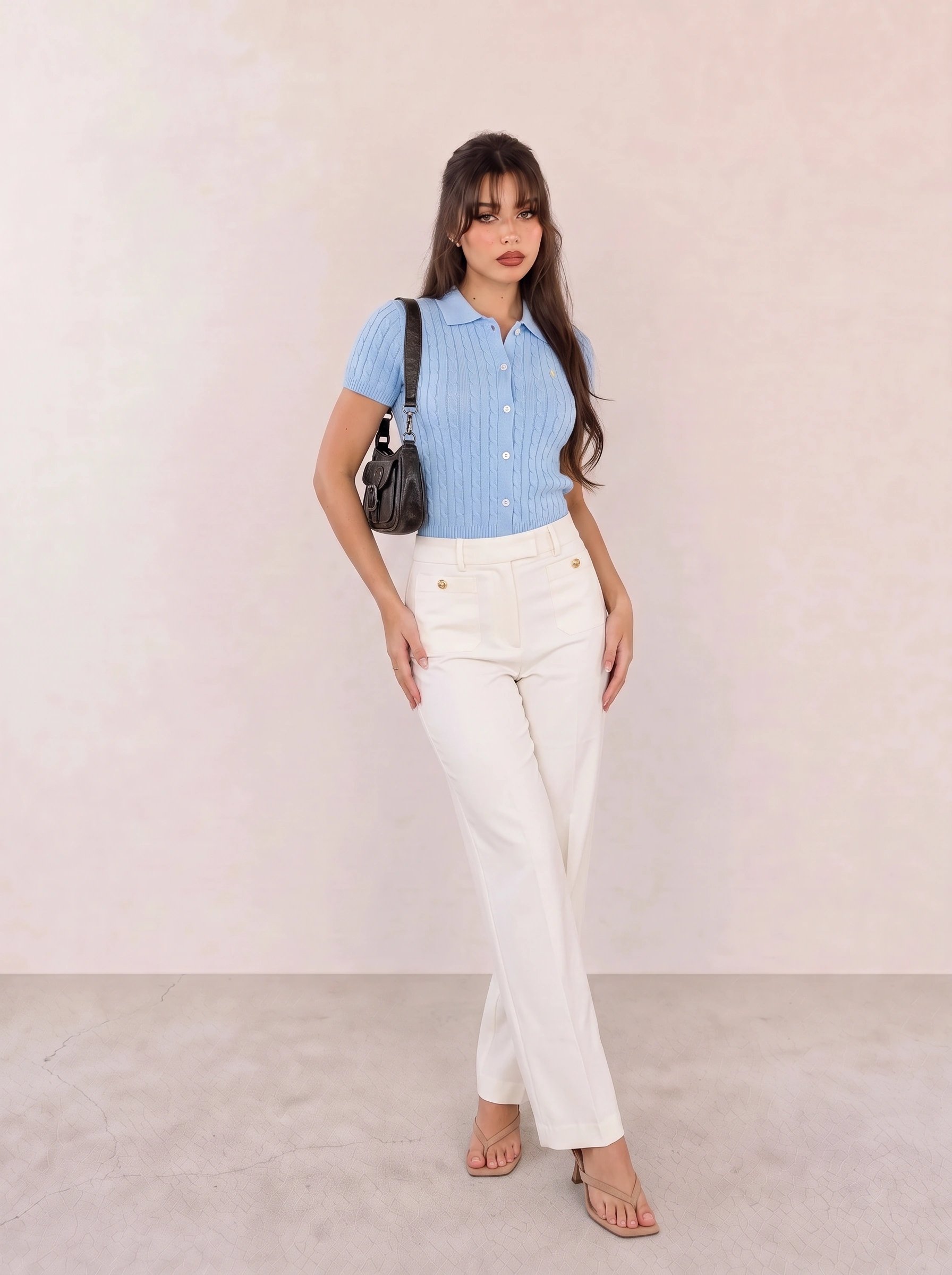
This is probably the strongest evidence in this whole roundup that old money style is moving somewhere new rather than just getting quieter. Light blue against white is a genuinely soft palette choice, and it only works because both tones sit in the same desaturated family — a brighter, more saturated blue would break the tonal logic and pull the outfit back toward something more casual and coastal than considered.
The kitten-heel sandal is doing more work here than a flat ever could — it lifts the whole silhouette without adding any visual bulk, which matters when the trouser is already this wide. Skip the heel and the proportions read a little unfinished.
Picture this on a Friday afternoon that starts as a work lunch and turns into wine on a patio somewhere with better light than your office — nothing about the outfit needs to change between the two.
If I had to pick one outfit from this list to represent where old money style is actually heading, it's this one. Everything else here is a refinement of the current quiet luxury moment; this is a preview of the next one.
Old money style was never really about wealth — it was about legibility, about being instantly readable as a certain kind of person. Quiet luxury is the same aesthetic with the legibility deliberately dialed down, and the next phase looks like it's dialing color back up without touching the restraint. For the full range of pieces behind this shift, the complete old money style guide breaks down the foundational pieces this evolution is still built on.